My son is obsessed with F1. He lines up his cars on the floor, and before every race I count him in: “One for the money, two for the show, three for Guido, and cuatro to go!” It’s our line from his Pixar Cars races.
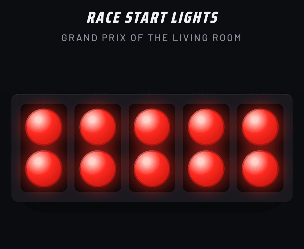
I wanted to give him the real F1 feeling instead: five red lights, a pause, lights out. I looked for an app and didn’t find one I liked, so we started using a YouTube video of the start lights. It worked, but it wasn’t really built for this.
So I made a small app that does the basics. It starts the race with the lights and times it until the first car crosses the line. It works, and it’s what we use now.
It’s a tiny experiment that put a big smile on my son’s face.
Try it: https://race-start-lights.vercel.app/. It works on your phone, and you can add it to your home screen to use it offline.